
THE APPLE TRUCK
Boost conversion rates for a seasonal apple e-commerce website by improving navigation system and information communication efficiency.
Timeline
Feb 2024 - May 2024
My Roles
UX Research, UX&UI Design
Tools
Figma, Figjam, Wix
Team
1 Project Manager
1 Director of Operations
1 UX Designer (I'm here!)
1 UX Researcher
OVERVIEW
Challenge
The Apple Truck, a local apple retailing e-commerce platform, facing the challenge of low conversion rate due to inefficient navigation system and ineffective information communication.
As a solo UX designer, my goal is to solve the problem within business constraints.
Solutions
Optimizing navigation system to help users efficiently locate products
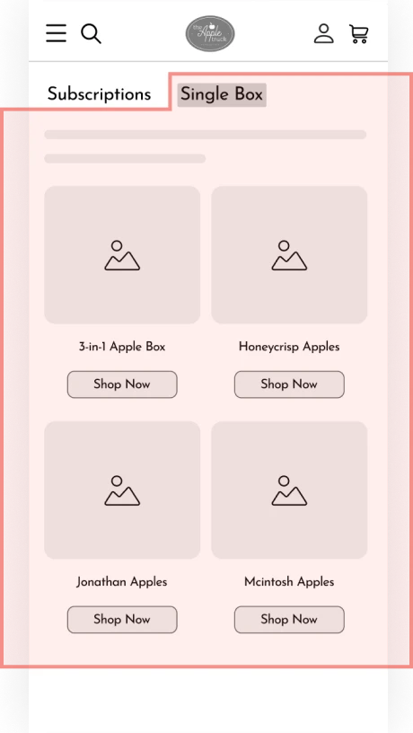
Solution 01 Hamburger Menu
Introducing a streamlined navigation bar with refined product categories, each linking to its corresponding scroll section, and only showing best sellers to encourage users to convert to their PDP.
Solution 02 Sequence of content in page structure
Relocating the available products section for the non-apple season to the front and adding a direct access button.
Optimize information delivery to help users understand key details
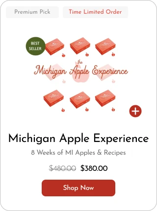
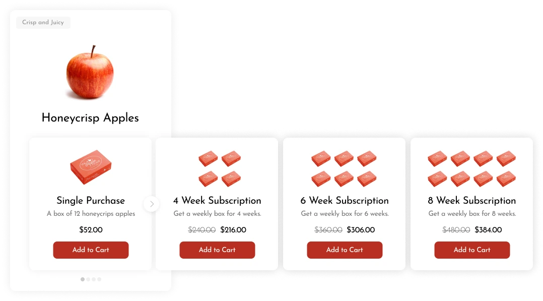
Solution 03 Product display redesign
Consolidating similar items into a single shuffling card with clear CTA buttons, presenting all essential details such as price, descriptions, and intuitive images.
Solution 04 Seasonal information communication
Offering a series of design solutions, including non-apple season onboarding messaging, clear information about apple season, and a coupon to encourage order placement.
PROBLEM BREAKDOWN
Background
The Apple Truck, a local start-up selling seasonal Michigan apples and related products. recently moved from Shopify to build an e-commerce website by their own.
The company retails fresh Michigan apples from August to December, and apple-made products all year round.

Problem
The Apple Truck website faced the challenge in lower conversion rate - only 0.68% compared to its conversion rate in Shopify - 1.38%.
Investigation
After conduct website analytics, I found when and where visitors leave this website without purchasing.
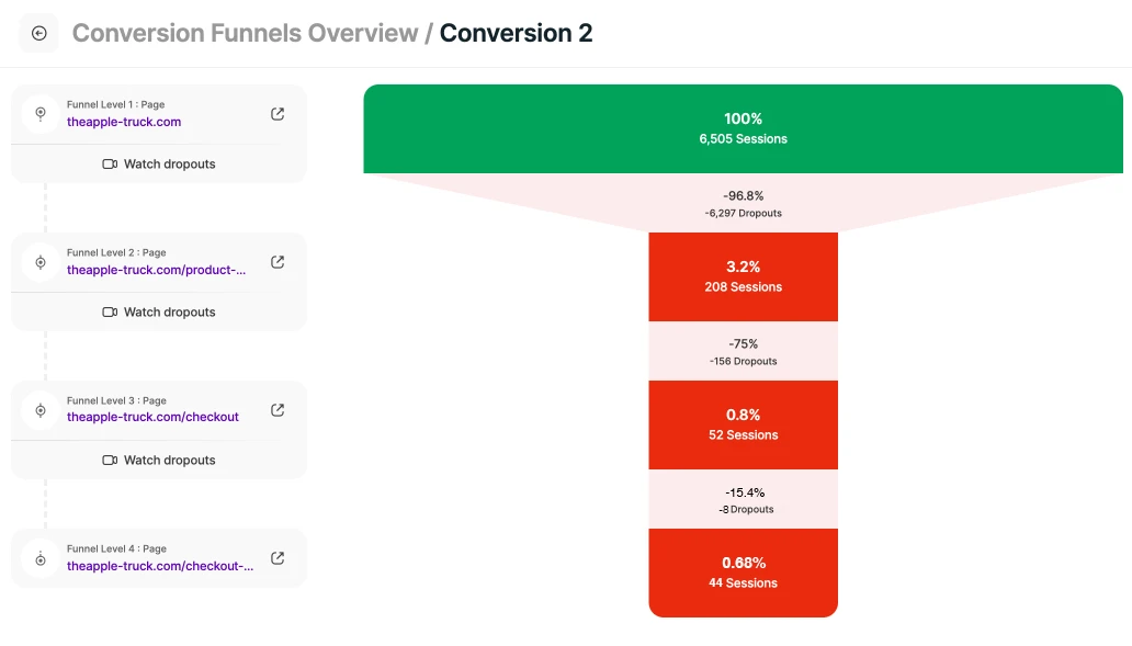
Dropouts on Home Page (96.8%)
Dropouts on Product Detail Page (75%)

Dropouts on home page were much worse in non-apple season compared to apple season
Redefined Problem
After dicussion with the cllient, considering priority & time constraints, the goal aligned at this stage is to solve:
The drop-off rates on home page was very high, especially during off-season.
DISCOVER
Website Analytics
What happened when users choose to leave the website?
I reviewed over 700 recordings out of 7000 and analyze the heatmap to gain in-depth insights into user behaviors and identify specific pain points affecting the overall user experience.


Summary of Results
4 Typical Users' Actions At The Previous Site
Action 01
78% Repeatedly tapping at the top of the screen
Action 02
64% Pausing on 'Sold Out' and exiting
Action 03
43% Rapid scrolling with frequent up-down movements
Action 04
57% Slow & repetitive scrolling and shuffling in the product display section
Usability Testing With Follow-up Interviews
Why did users behave the way they do?
Another UX researcher and I facilited usability tests with 32 participants divided into 4 groups with follow-up questions
Each group performed one task
— either Task 1 finding a specific product to order or Task 2 browsing for products to place orders
— on one version of the website, either during apple season or non-apple season.
Combining Users' Actions & Testing Results
2 Key Pain Points of Users

Can't Find Available Products
Action 01
Tried to find a navigation bar to locate products
Action 03
Tried to locate products by quick scanning

Can't Comprehend Information
Action 02
Thought there is no available product to browse
Action 04
Tried to figure out differences among products
DEFINE
Insights
What prevented users from processing to the next step?
Can't Find Available Products
Inefficient Navigation System


Available products at the bottom in non-apple season
Navigation bar missing
Can't Comprehend Information
Ineffective Information Communication

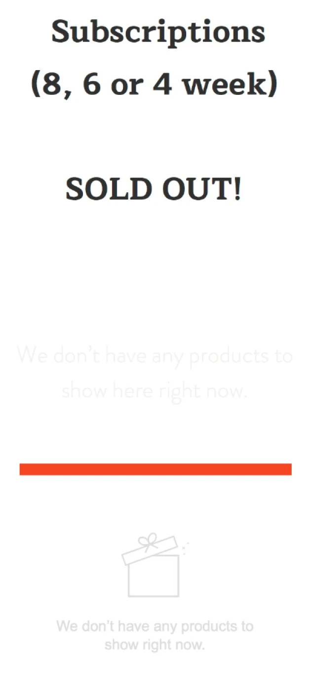
The 'SOLD OUT' message leading to confusion
HMW
optimize the navigation system & information delivery
to help users efficiently locate products & understand key details?
DESIGN PROCESS
Design Proposal
How did I explore the opportunities initially?
01
Introduce an intuitive navigation bar with sub-menus
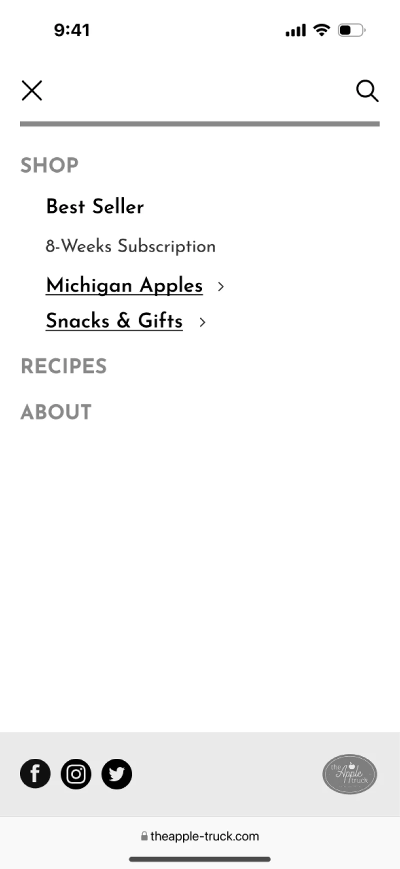


Adding an intuitive mobile navigation bar with a hamburger menu
See details
Organize the client-provided items and classify them under relevant sub-menu categories.
Combining repeated items, reorganizing categories & adding seasonal content
Showcase only the bestsellers, with links under each category directing users to the product gallery page.
02
Reorganize page structure & refine seasonal messaging
Pre-order feature in non-apple season
Adding a pro-order feature to upsell future fresh apple shipments and maintain customer engagement throughout the year
Snacks & gifts session repositioning
Repositioning the available products just under the pre-order fresh apple section during the non-apple season to improve visibility and drive conversions.


Landing section
Fresh apple section
Snacks & gifts session
Recipe & About sections
03
Redesign fresh apple product gallery section for clarity
Simplify product display by consolidating repetitive options into a single item to reduce confusion and enhance clarity for users.


3 to 1
Negotiation With The Client
But conflicts with the client coming
The client partially disagreed with my initial proposal, leading us to negotiate and establish clear boundaries. I needed to design within constraints of their business model, minimize costs, and avoid work beyond the original project scope.

❌ Adding extra pages increases development time & costs, which is unaffordable at this time.
✅ Avoid an extra gallery page by listing all items on the home page and adjusting the hamburger menu.
❌ Lack of staff for handling pre-orders, and the business model doesn't support it.
✅ In non-apple season, the primary goal is to boost the conversion rate for available products.

❌ Combining items requires additional work on PDP, which goes beyond original scope.
✅ During apple season, all apple options must be displayed on the home page to avoid extra work on PDP.
Design Iteration
Alternative Design Solutions Exploration with Usability Testing
Challenge 01
How to present all the items on the home page without overwhelming users while ensuring they can access information efficiently?
Option 1
Divide items into two categories

Subscriptions
Single purchases
❌ Still too many items
Option 2
Add tabs to reduce the number of items displayed at once

Subscriptions
Single purchases
❌ Extra step
Option 3
Group all options for a single type of apple into one unified card.
Subscriptions
&
Single purchase

✅ Quick decision making
Switching from 2 columns to 1 column layout for better focus, clarity, & simplified decision-making based on scrolling behavior
After layout exploration and card design iterations, the testable prototype is coming

Single Item Card
2
1
Multi-Option Apple Card

3
4
5
Next, I partnered with a UX researcher to conduct 12 usability testing sessions, uncovering valuable insights for design iteration
1
Looks like a selectable tag
2
Leads to misunderstanding
3
Too many CTAs are still overwhelming
4
Users can’t understand subscription options
5
Without a price, users are less likely to click to the next page
1
2

1
Emphasize the time-limited tag to enhance conversion rates
2
Replace the 'add' button with a text-based CTA for consistency
Single Item Card
Multi-Option Apple Card
4
Incorporating descriptions and intuitive images to enhance user understanding
5
Adding prices for each option to maintain consistency and inform users
3
Switching multiple options to shuffling cards, showing one CTA at a time
3
4
5
Challenge 02
How to modify the hamburger menu to enable users to locate products efficiently?
💡 Introduced a mutually exclusive accordion to reduce cognitive load
❌ But the design remained text-heavy.

💡 Added thumbnails to improve visual recognition
❌ But the items were still unrecognizable


💡 Refined the layout to show only categories to streamline navigation, directing users to corresponding scroll sections
✅ Simplifies navigation and reduces clutter
✅ Speeds up decision-making with clear product categories
✅ Reduces cognitive load to help locate products

Challenge 03
How to encourage users to convert to PDP of available products in non-apple season while clearly communicating info about the upcoming apple season?

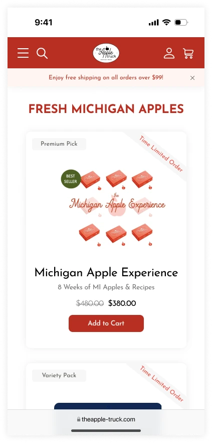
Seasonal Description & CTA
Start with a clear, leading message that informs users of current non-apple season offerings, accompanied by a CTA button that directly guides users to the available products section.
Visual Guidance for Seasonal Flow
Use an intuitive image that illustrates the seasonal timing, with arrows guiding users to scroll down and discover available products.
Reward Mechanism
Introduce a coupon for fresh apples to encourage immediate orders, which not only boosts conversion rates now but also encourages users to return during apple season for repeat purchases.
FINAL DELIVERABLES
How to optimize navigation system help users efficiently locate products?
Solution 01 Hamburger Menu
Introducing a streamlined navigation bar with refined product categories, each linking to its corresponding scroll section, and only showing best sellers to encourage users to convert to their PDP.
Solution 02 Sequence of content in page structure
Relocating the available products section for the non-apple season to the front and adding a direct access button.
How to optimize information delivery to help users understand key details?
Solution 03 Product display redesign
Consolidating similar items into a single shuffling card with clear CTA buttons, presenting all essential details such as price, descriptions, and intuitive images.
Solution 04 Seasonal information communication
Offering a series of design solutions, including non-apple season onboarding messaging, clear information about apple season, and a coupon to encourage order placement.
REFLECTION
Communicating with clients who are unfamiliar with UX principles can be challenging. It is crucial to find ways to convey concepts clearly and effectively, ensuring that clients understand the value of the design process.
Compromise is essential in design, as working within constraints is a valuable skill. Balancing trade-offs is a common aspect of the design process, making it vital to align goals and set boundaries with clients from the beginning.
Working independently without guidance can be difficult, but it serves as an effective way to develop as a designer capable of making informed decisions. This experience fosters confidence and growth, enabling designers to navigate challenges more effectively.
UX writing is crucial, as it encompasses various perspectives. Using clear and appropriate language to convey meaning that users can easily understand is essential. It's important not to assume that everyone will interpret your expressions in the same way.
