Clinexi · Maternal Mental Health
Helping OB clinicians identify and respond to maternal mental health risks within their existing workflow.
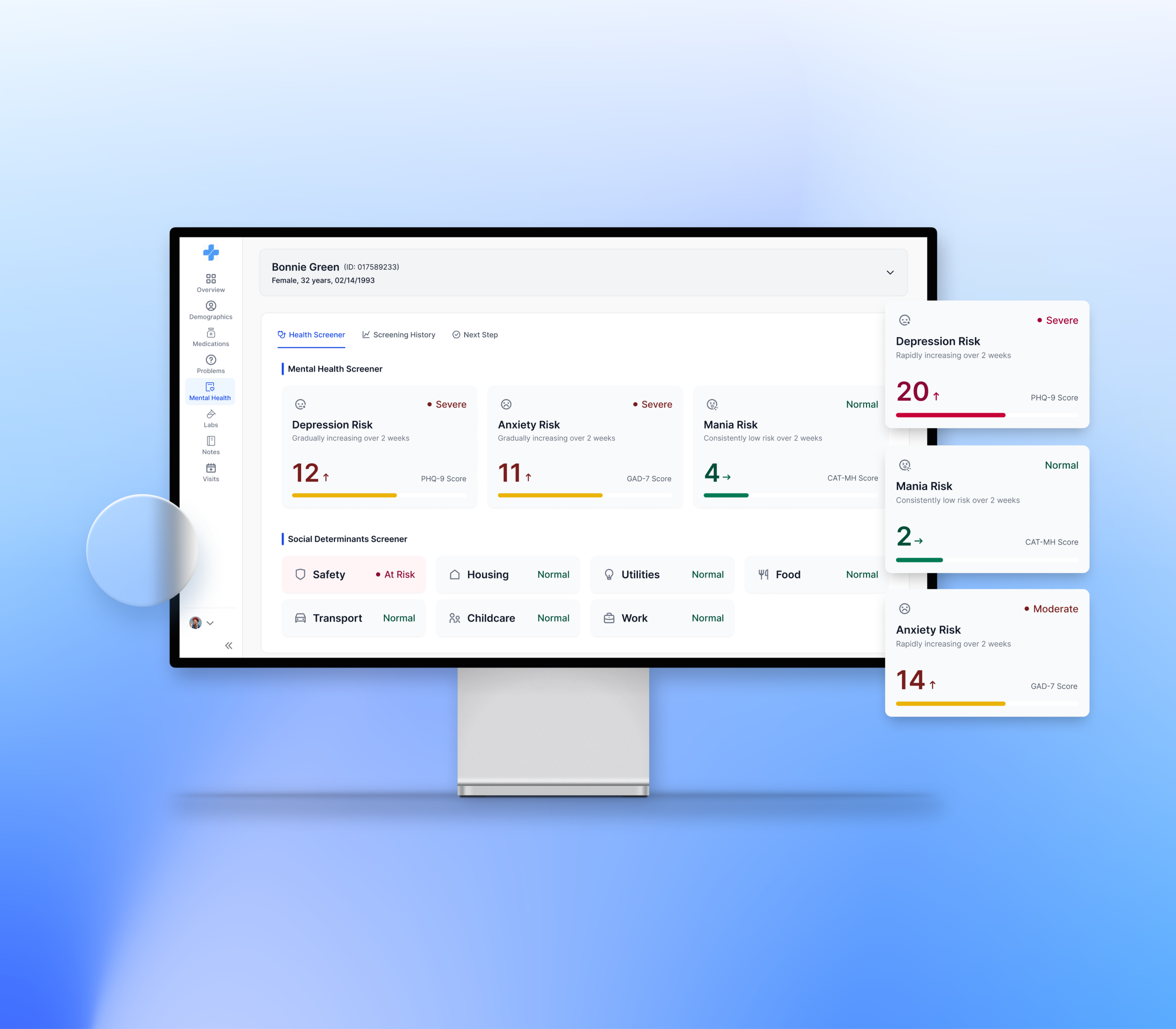
Clinexi brings mental health screening results into the EHR, giving OB clinicians a faster way to understand a patient’s risk and decide what to do next.
The problem
Maternal mental health screening exists. Acting on the results is still difficult.
Clinexi worked with a third-party screening provider to collect mental health and psychosocial information from pregnant patients.
The idea was to bring this information into the EHR, so OB clinicians could catch potential risks earlier and intervene during routine care.
The team already knew what information clinicians needed. The first version had been reviewed by clinical professionals and included screening results, patient context, history, and recommended actions.
The problem was how that information was delivered.
The starting point
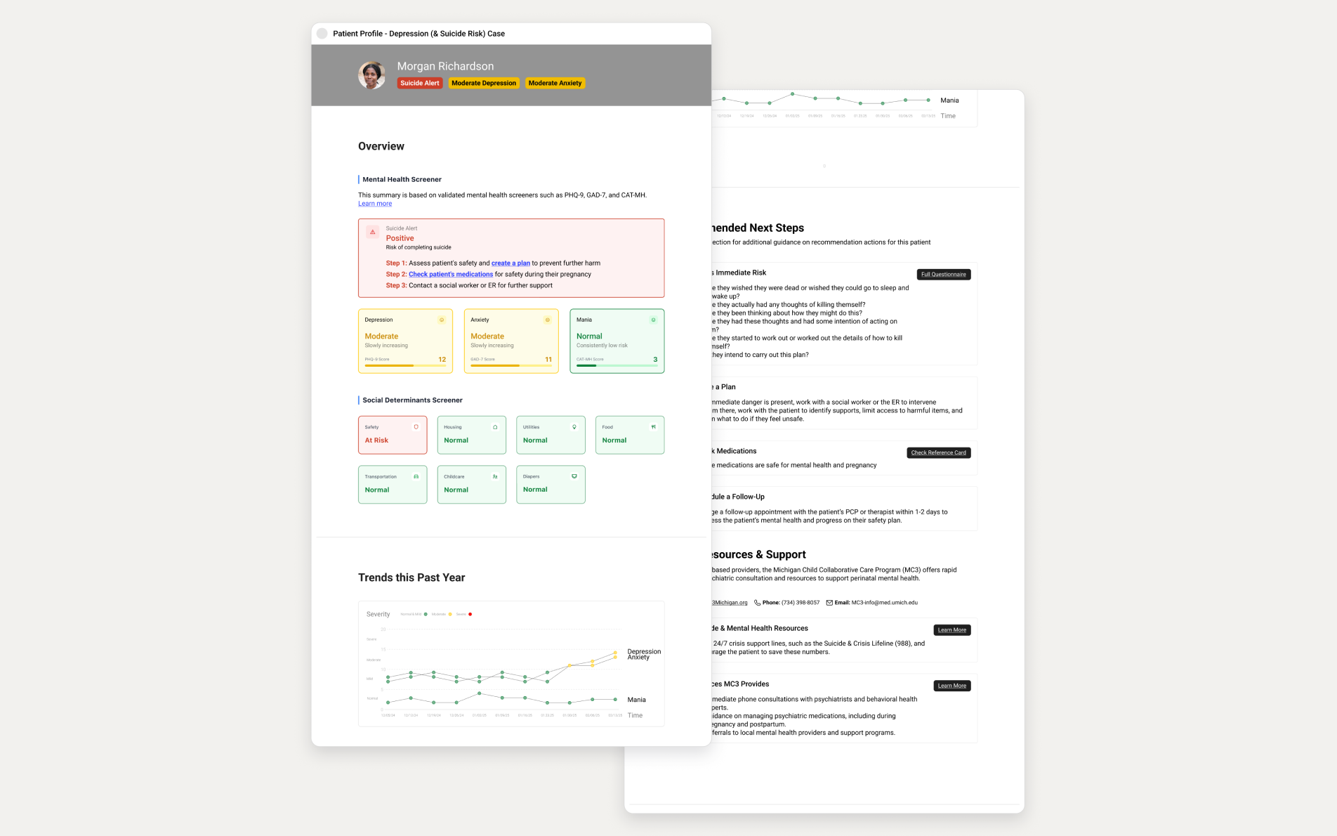
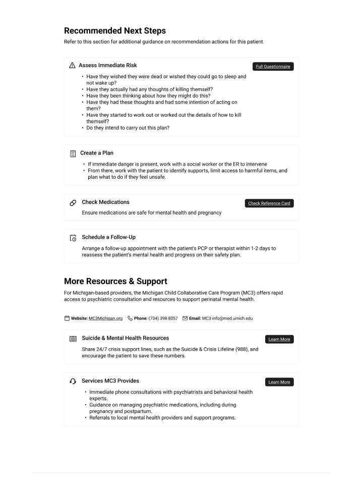
The first version was a PDF.
It was clinically comprehensive, but clinicians had to spend too much time reading through the report to answer a few basic questions:
Q01
Is this patient at risk?
Q02
What should I pay attention to?
Q03
What should I do next?
Results were spread across dense sections, and recommended actions often led to additional documents and external resources. For an OB clinician already working within a short appointment, that was too much information to process before they could act.
What made it hard
- 01Risk was buried in dense information
- 02Results and history required manual comparison
- 03Recommended actions lived outside the workflow
Reframing
So what actually needed to change?
The first instinct could have been to simply turn the PDF into a cleaner digital interface. But that wouldn’t solve the underlying problem.
OB clinicians aren’t mental health specialists. The new experience needed to help them make sense of the information—not just display the same information more nicely.
So I focused the MVP around three questions:
01 · SEE
What needs my attention?
Quickly identify current and immediate risks.
02 · UNDERSTAND
Has anything changed?
Use previous screening results when more context is needed.
03 · ACT
What should I do next?
Turn the result into a clear next step without leaving the workflow.
Reworking the information architecture
I started by separating information clinicians need now from information they might need next.
The original version put patient information, current results, screening history, and actions into one long experience. But they don’t carry the same priority.
I reorganized the experience into three sections:
HEALTH SCREENER
See key insights at a glance
Current screening results and important risk signals stay upfront, so clinicians can quickly understand what needs attention.
SCREENING HISTORY
Understand what changed
Past results sit one level deeper. Easy to access when clinicians need more context, but they don’t compete with today’s results.
NEXT STEP
Take action
Assessment, medication review, resources, and follow-up live together, so clinicians don’t have to jump between results and external guidance.
LEVEL 1 · NOW
Health Screener
See key insights at a glance
LEVEL 2 · WHEN NEEDED
Screening History
Understand what changed
LEVEL 3 · ACT
Next Step
Take action
The new structure follows the questions clinicians need to answer during the visit, rather than the way the underlying data happens to be organized.
Patient context
How much patient information should stay on the screen?
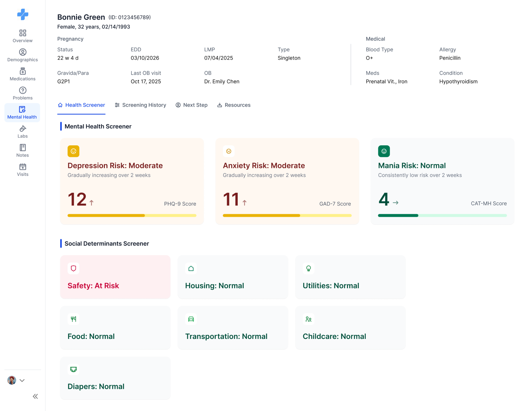
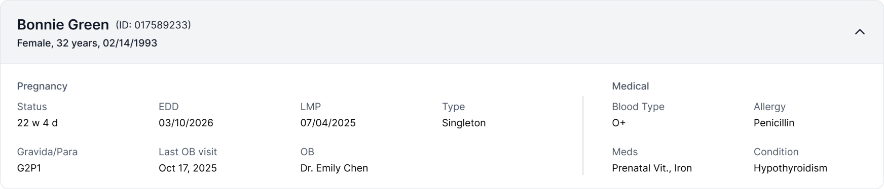
One of my early questions was whether the page needed to show a complete patient profile.
Because Clinexi sits inside the EHR, clinicians already know who they’re seeing and have access to the full patient record. Repeating that information would take space away from the reason they opened Clinexi in the first place.
At the same time, some patient context still matters when interpreting a screening result.
I kept it accessible, but out of the way.
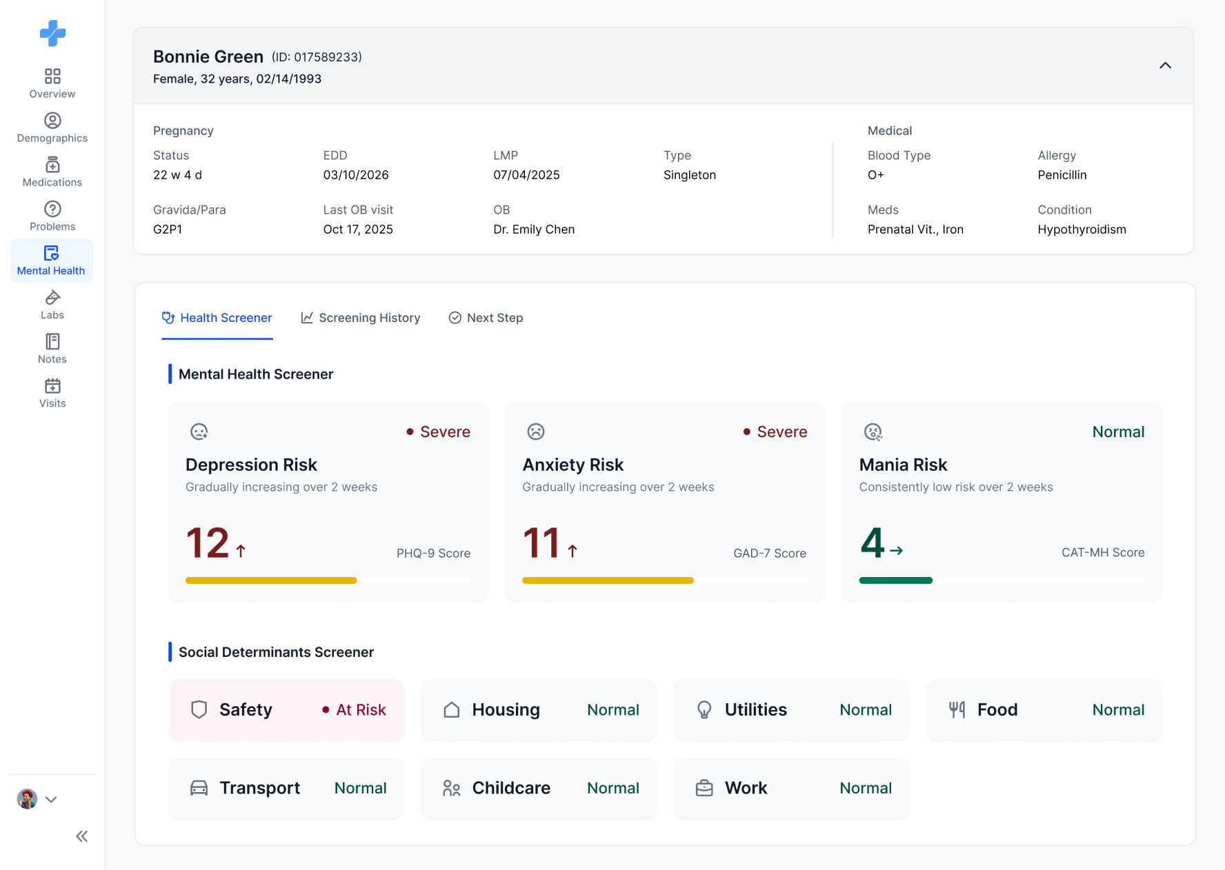
The final design uses a collapsible patient card. Basic context stays available throughout the experience, while screening results remain the focus.
Before
After
EXPANDED ON DEMAND
One click opens pregnancy and medical context when a result needs it.
COLLAPSED · DEFAULT

EXPANDED · ON DEMAND
Making screening results easier to read
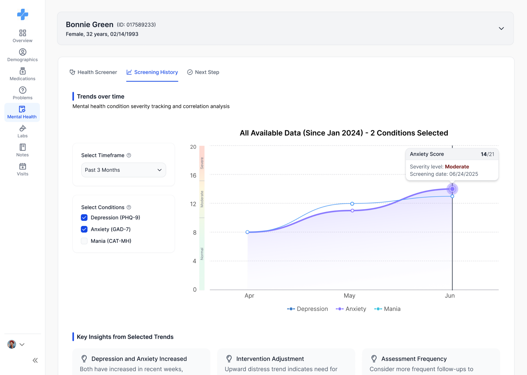
A score tells you what happened today. History tells you whether it means something more.
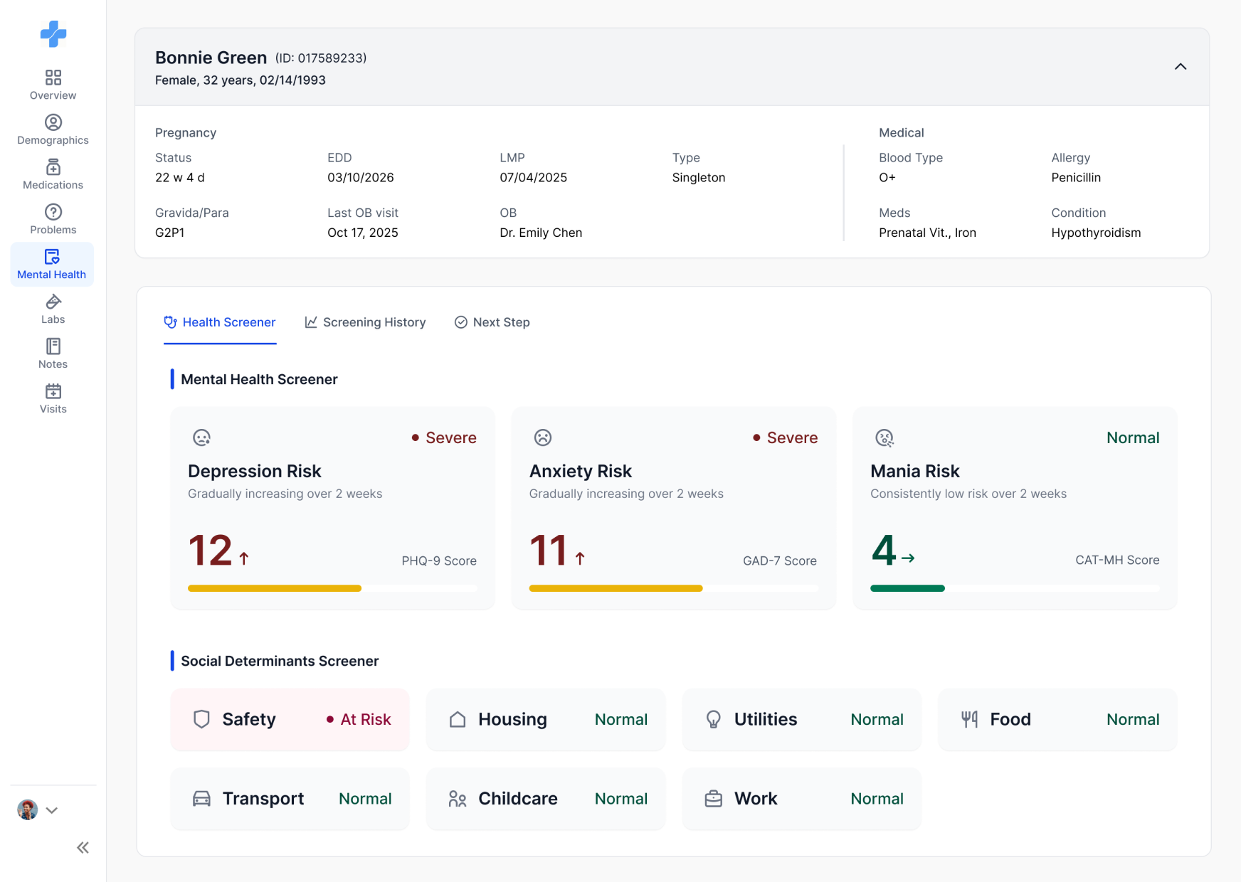
The current screening result needed to work on its own: clinicians should be able to scan the page and spot elevated risks without digging through details.
But during exploration, another question kept coming up:
That’s why I kept the current result and screening history connected, but didn’t put everything on the same screen.
Main view
What is happening now?
Screening history
How did we get here?
Exploring how much visual emphasis was enough
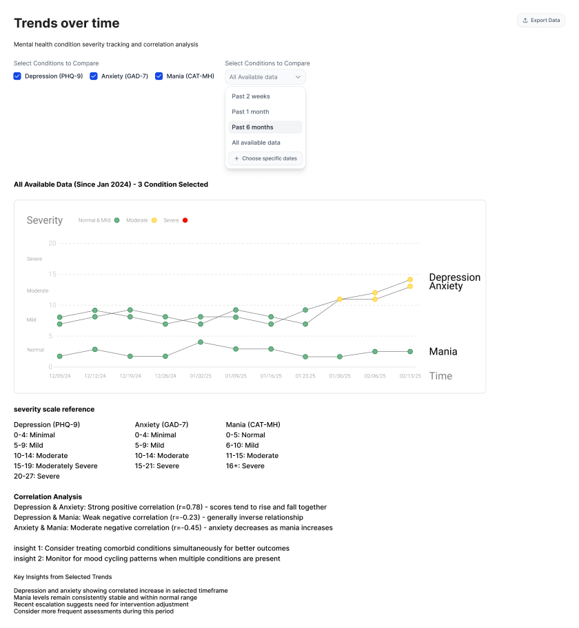
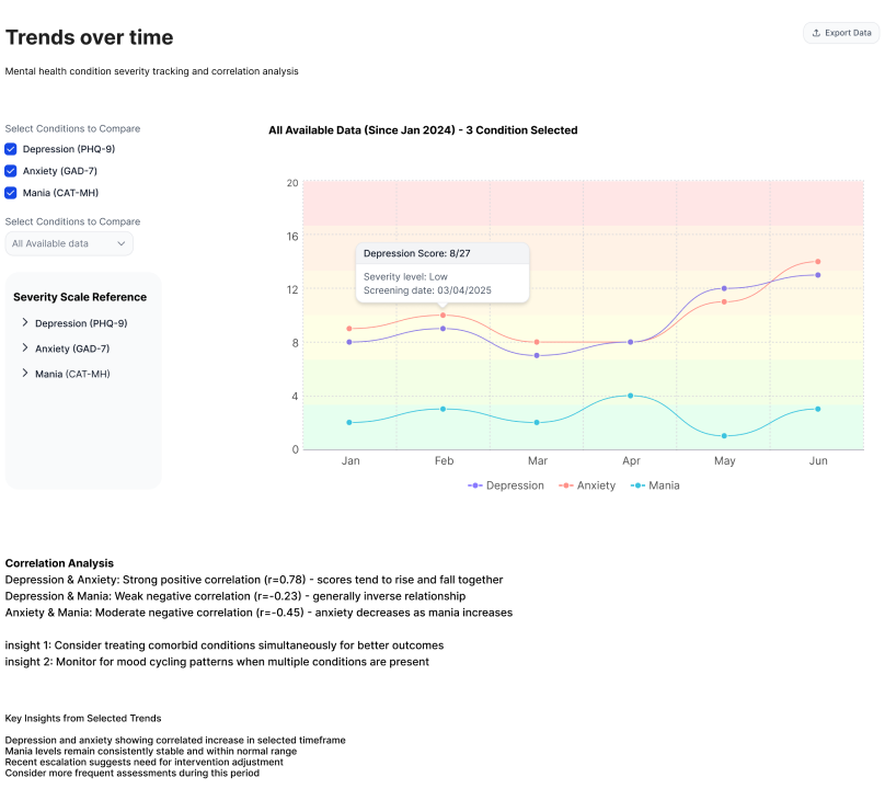
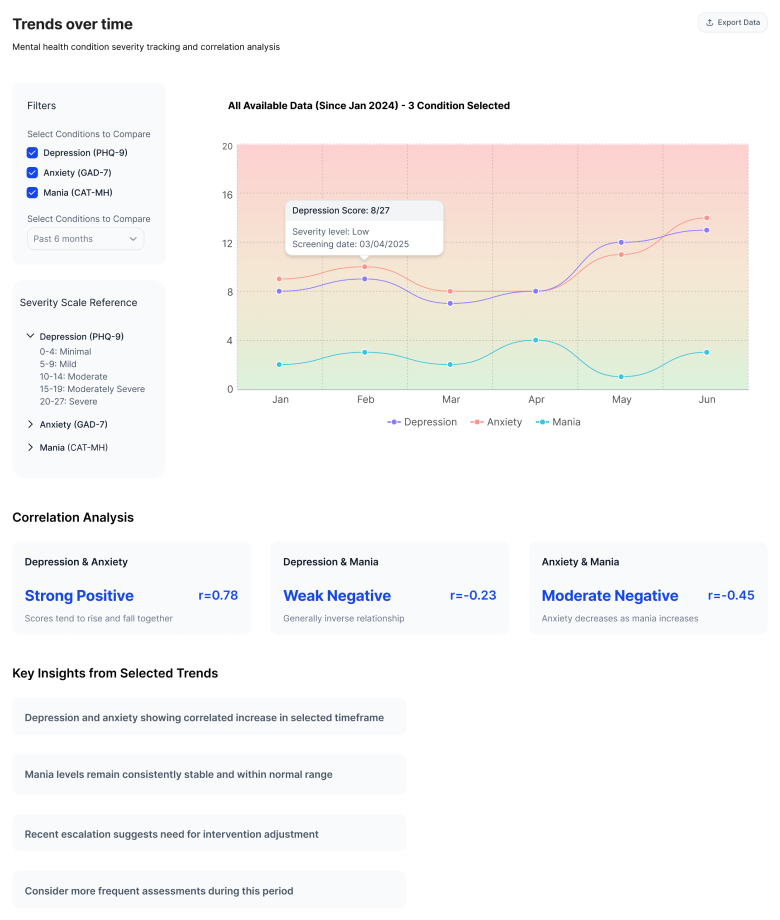
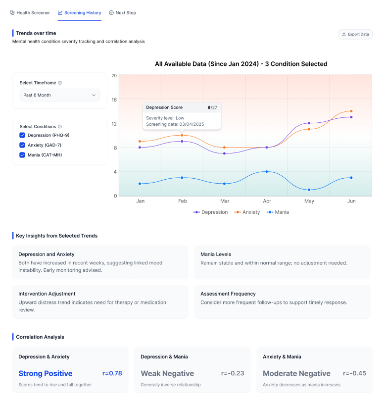
I tested several ways of presenting severity, scores, and supporting information. Some versions made every data point equally visible. They were comprehensive, but harder to scan.
Later iterations gave more weight to the information that could change the clinician’s decision, while allowing supporting details to sit quietly in the background.
ITERATION 01
ITERATION 02
ITERATION 03
ITERATION 04
FINAL
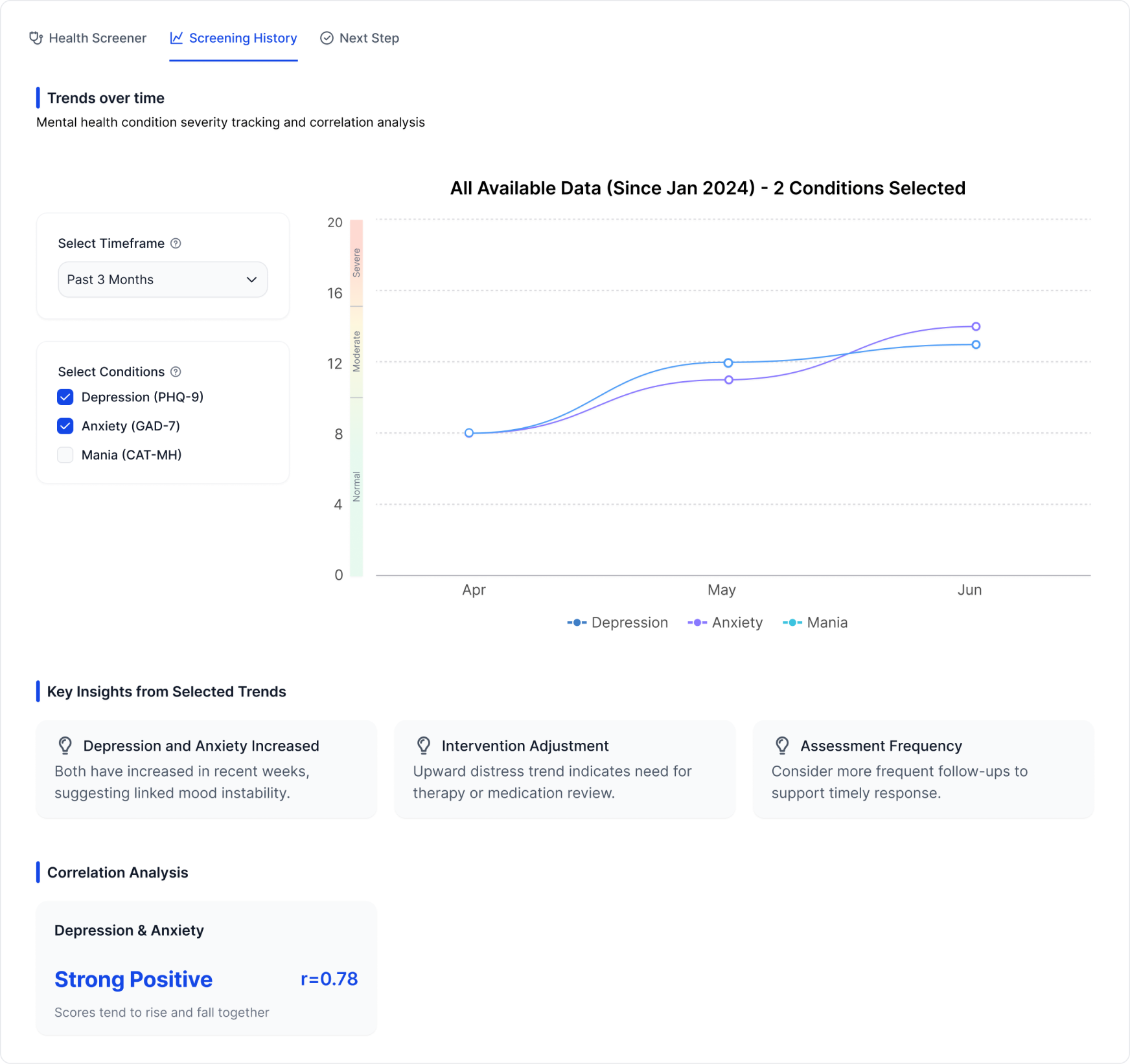
The goal wasn’t to make the data look simpler. It was to make the important part easier to find.
Finding the risk was only half the job
The bigger problem was what happened next.
In the original experience, clinicians could see recommended actions, but carrying them out was another story.
Guidance lived in long documents and external links. Clinicians still had to read through the material, decide what applied to this patient, and figure out how to turn it into an actual care plan.
So the next part of the MVP focused on bringing that work into the product.
Next Step
Turning recommendations into a workflow
The original guidance grouped intervention into four broad areas. Once I started mapping out what clinicians actually had to do, those categories didn’t translate cleanly into a usable flow.
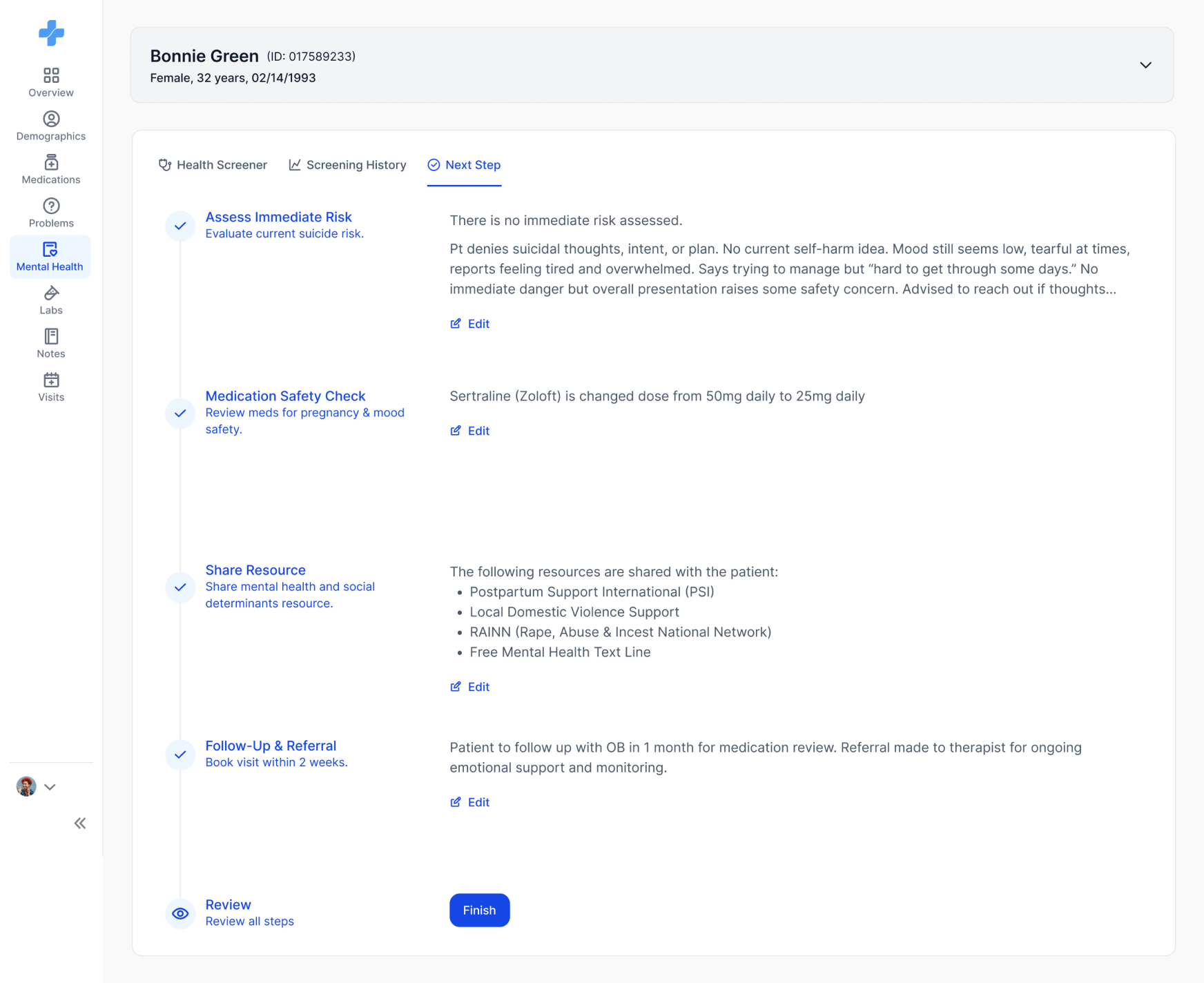
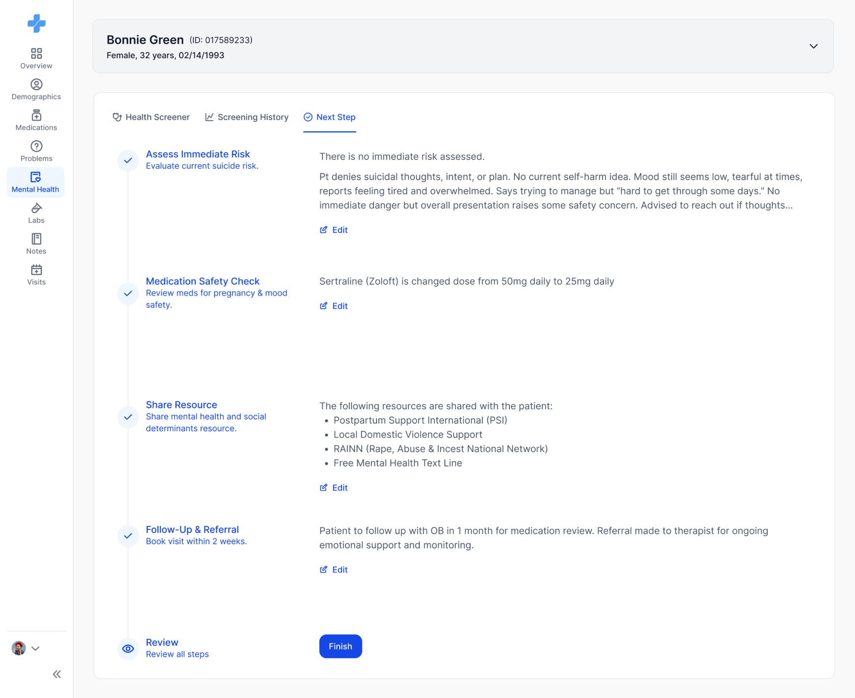
I reorganized them into five steps:
Next step · intervention flow
Assess Immediate Risk
Check whether the patient needs urgent intervention.
Medication Safety Check
Review current medications for pregnancy and mood safety.
Share Resource
Choose which mental health and social resources to share with the patient.
Follow-Up & Referral
Schedule the next visit or refer the patient for continued care.
Review
Confirm everything that has been decided before finishing.
The order matters. Before reviewing medication or sharing resources, the clinician first needs to know whether there is an immediate safety concern.
The final review was added later to give the flow a clear ending and make unfinished actions easier to catch.
Next Step
Making a long process feel manageable
Once the recommendations became an interactive flow, another problem appeared.
I added a persistent step indicator so the intervention felt like a finite task, rather than another open-ended clinical document. Clinicians can see what they’ve completed, where they are, and what remains before finishing the review.
Next Step · Safety
Assessing immediate risk without leaving the page
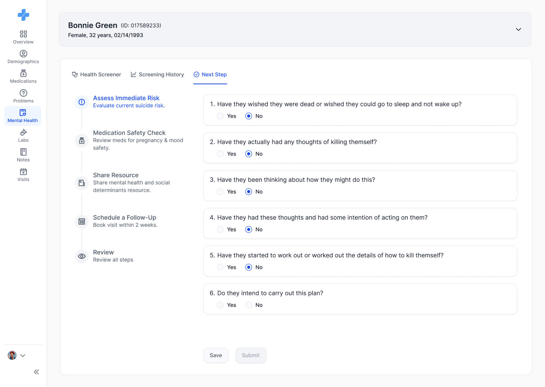
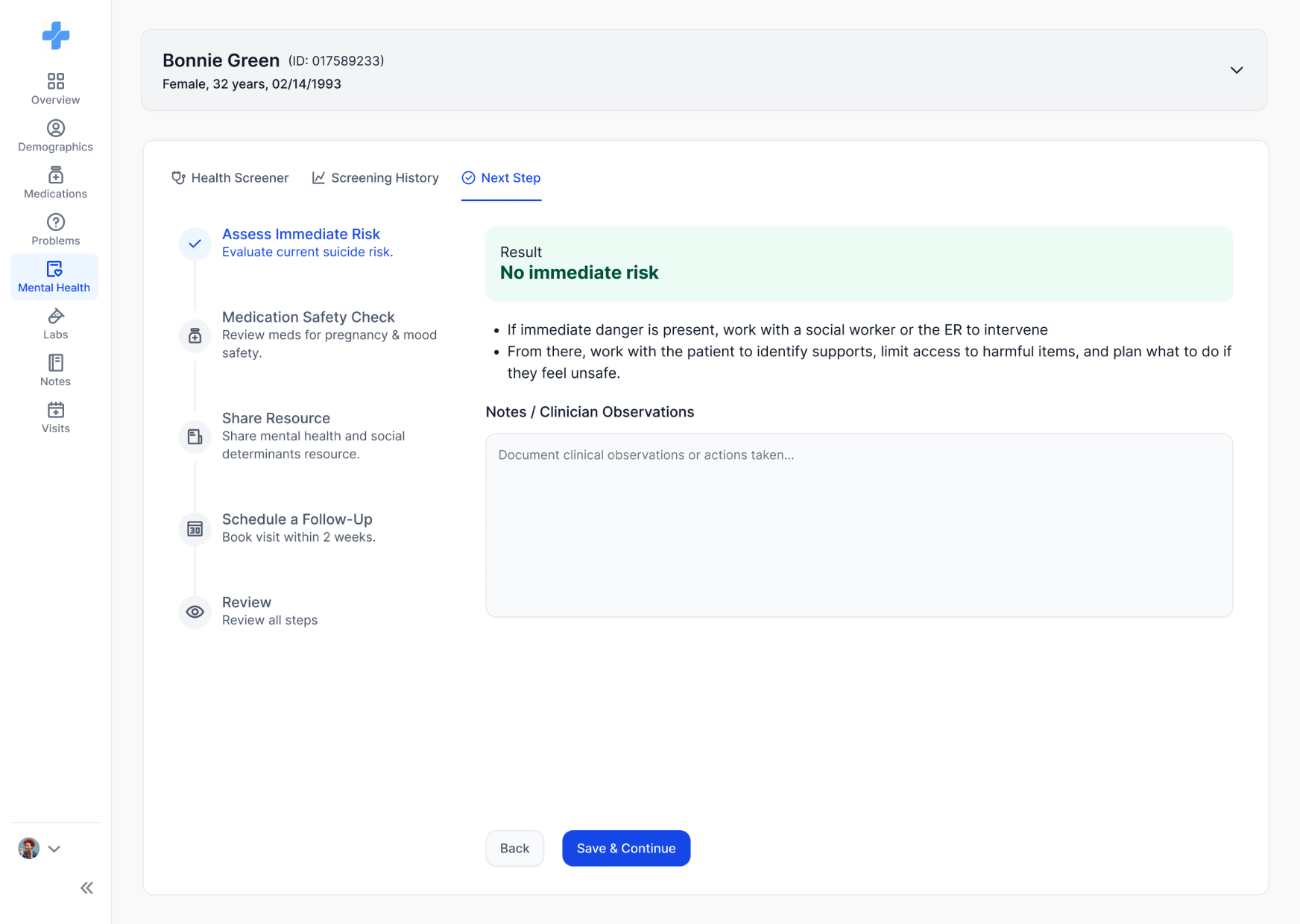
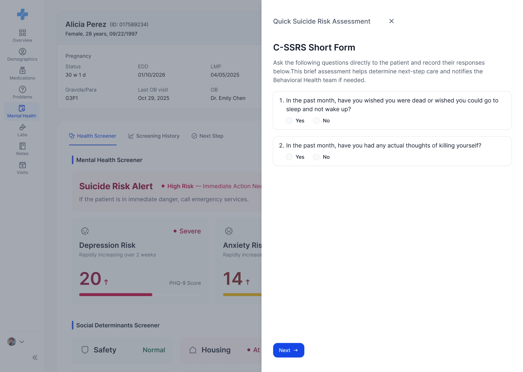
For high-risk results, especially suicide-related signals, sending clinicians to another document added friction at exactly the wrong moment.
Instead, the assessment became an interactive questionnaire inside Clinexi. Clinicians can complete the questions and see the result immediately, without switching tools or manually interpreting a separate form.
Next Step · Medication
Bringing medication guidance into context
Medication review presented a similar problem.
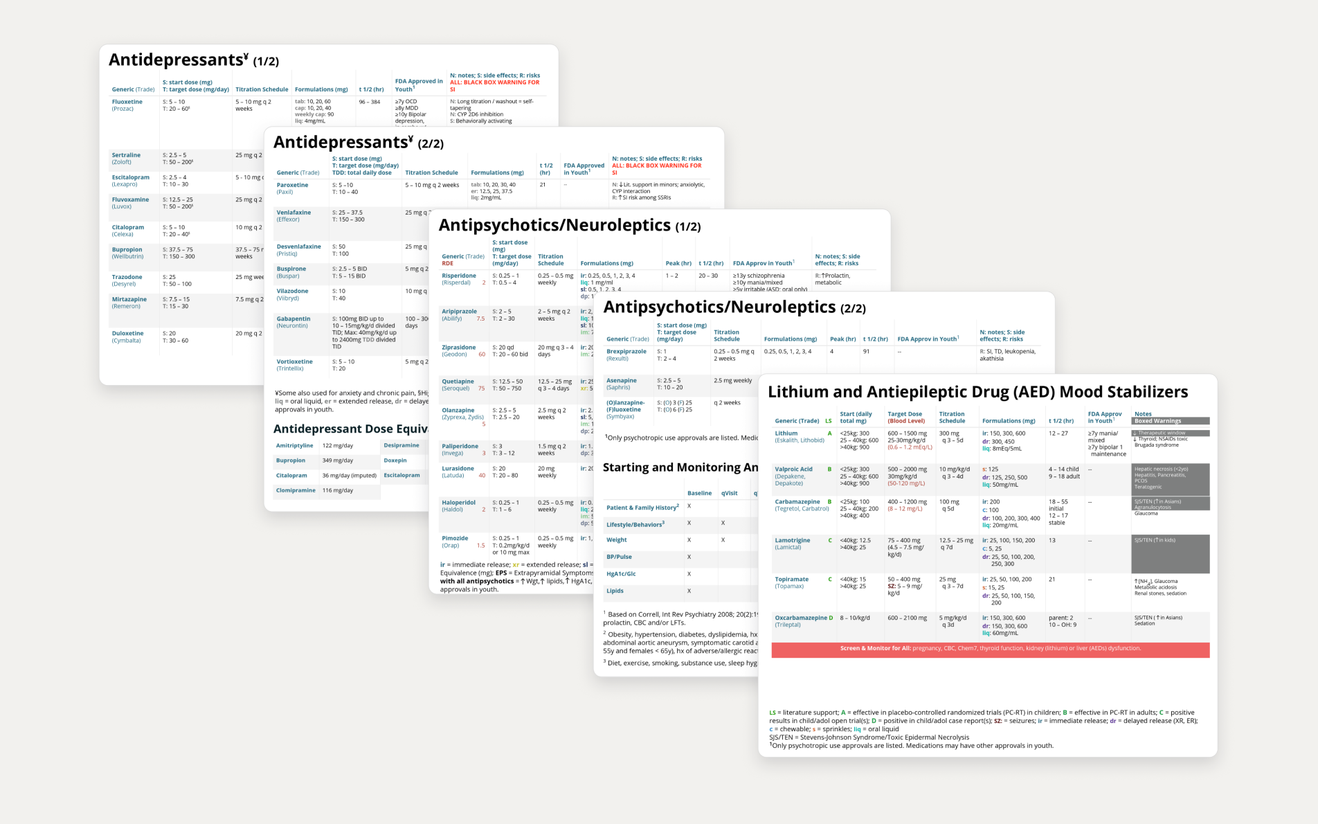
The original guidance relied on a large reference table. It contained the necessary information, but clinicians had to search through it and connect the guidance back to the patient’s current medication themselves.
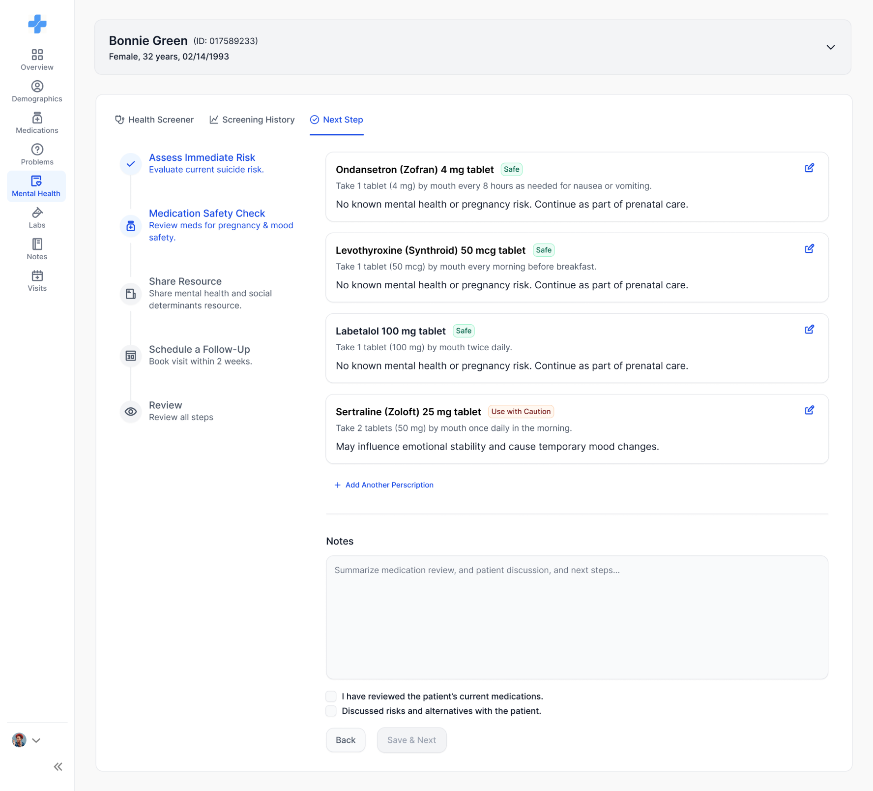
In the redesign, Clinexi surfaces the relevant medication information directly within the patient’s flow.
Before
After
Resources
I simplified resources twice.
Resources went through one of the biggest changes during testing.
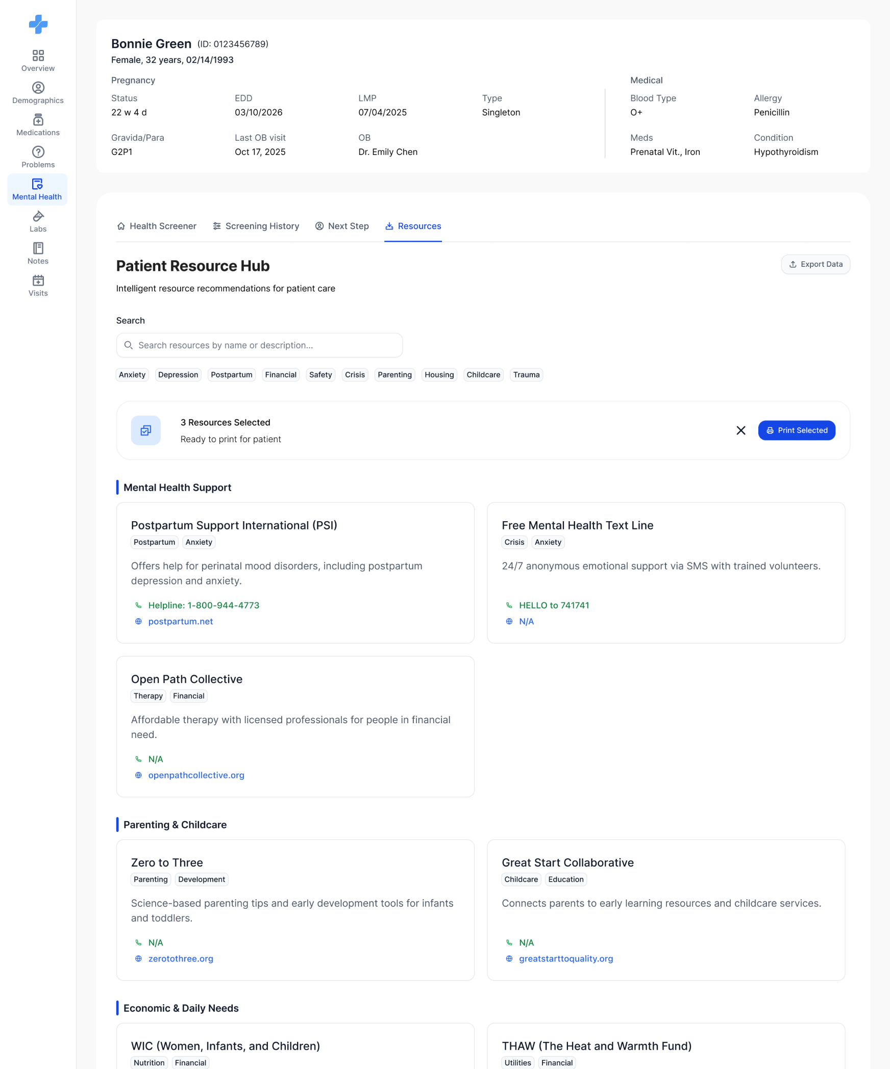
V1 · First attempt
I brought the full resource content into Clinexi so clinicians wouldn’t have to open external documents.
That solved one problem—but created another.
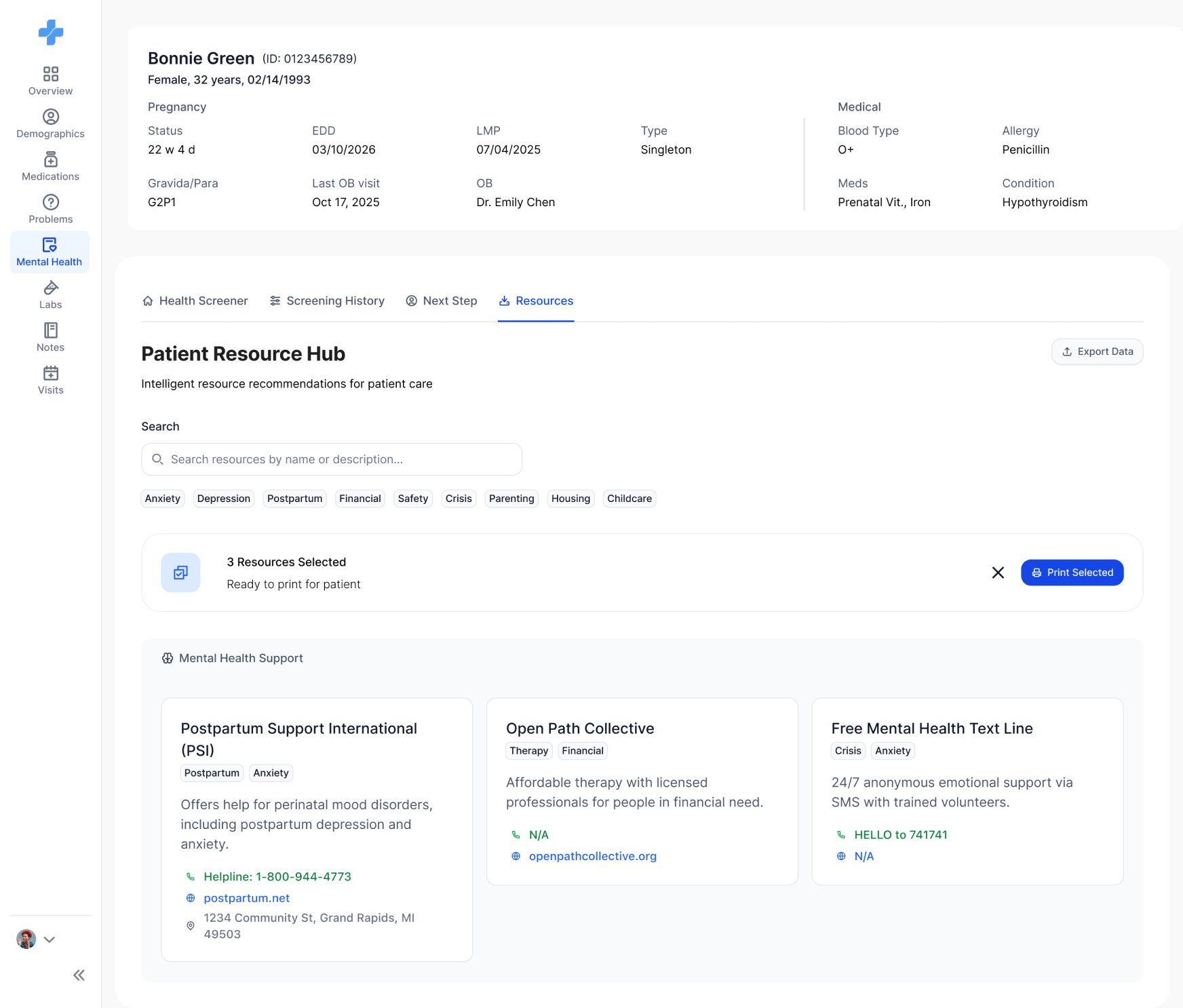
V2 · Grouped & selectable
I grouped resources by need and let clinicians select which ones to print. But every card still showed the full details—helplines, websites, addresses.
The clinician mainly needs to know:
01
What is being recommended?
02
Why is it relevant?
03
Do I want to keep or change it?
V3 · A short list to print
Clinicians don’t need to read those details—they only need to decide what to hand the patient. The final version is a short recommended list: remove what doesn’t fit, add from the library, then print. Details open on demand.
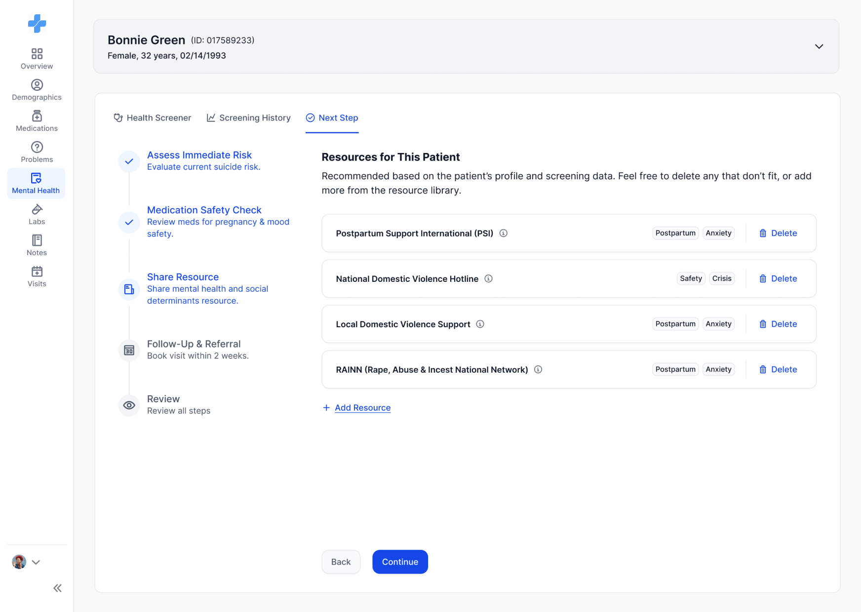
The full library opens in a drawer only when the clinician wants to add something.
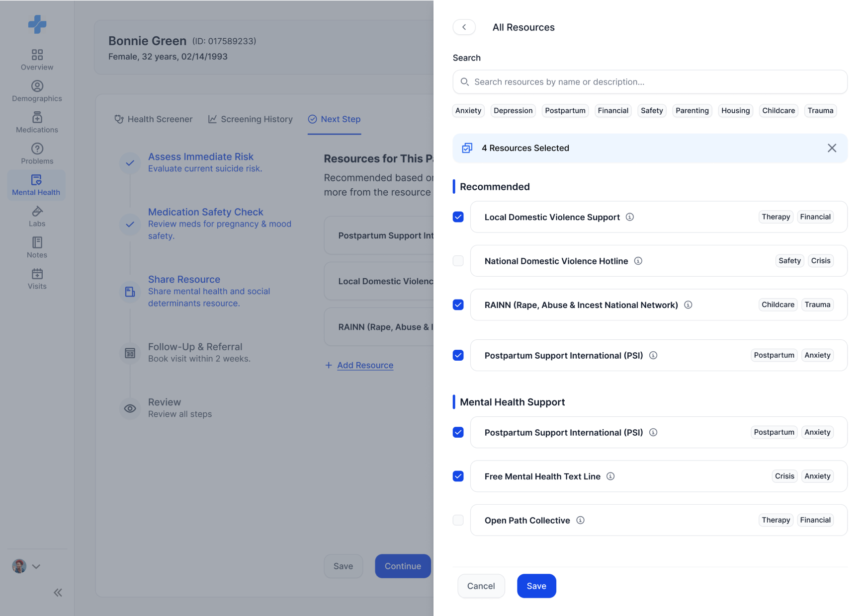
Clinexi can make a recommendation, but the clinician keeps the final say.
One flow doesn’t work for every patient
Suicide risk needed to break the normal sequence.
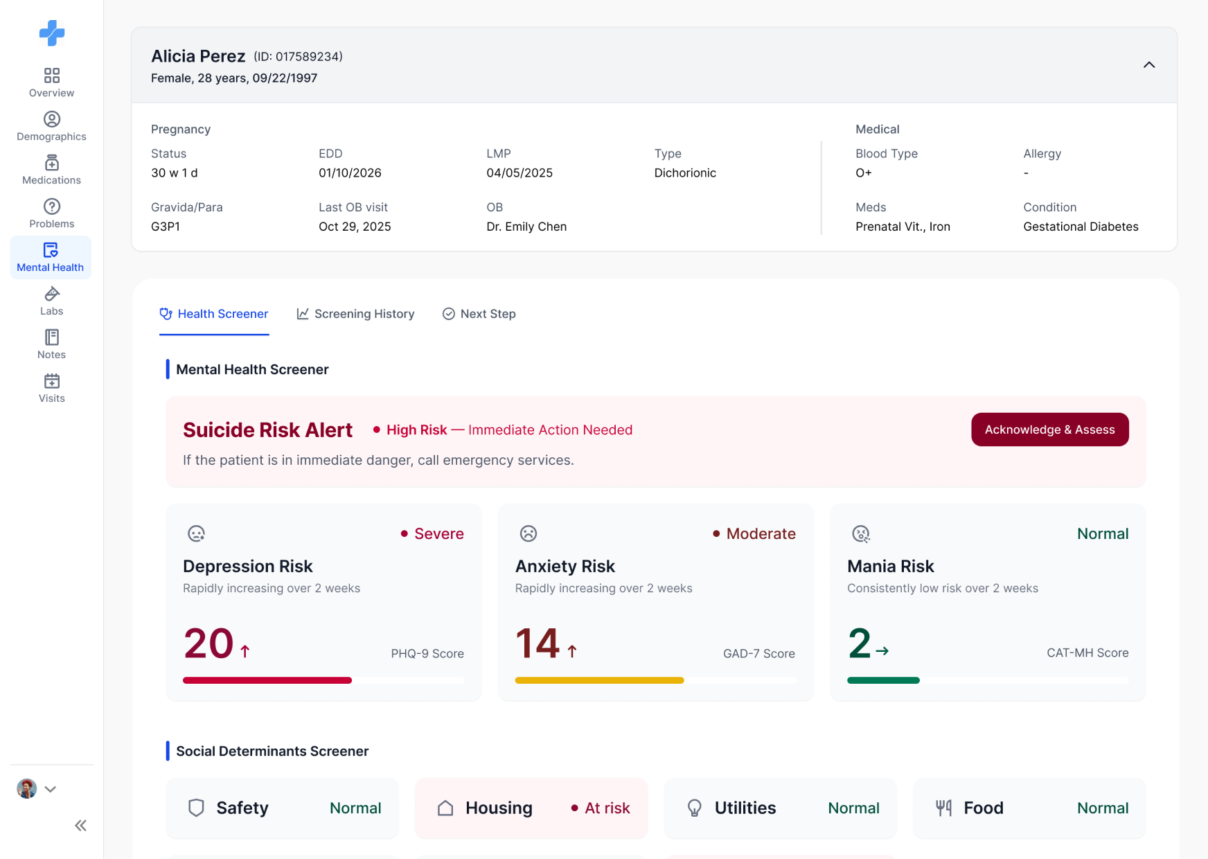
Most patients can move through the standard flow. But a suicide alert shouldn’t wait for the clinician to finish reviewing everything else.
For this case, the system surfaces the risk assessment immediately. Once the immediate safety question has been addressed, the clinician can continue with the rest of the review.
Standard flow
Suicide alert
01 · ALERT
02 · ASSESS
03 · ESCALATE
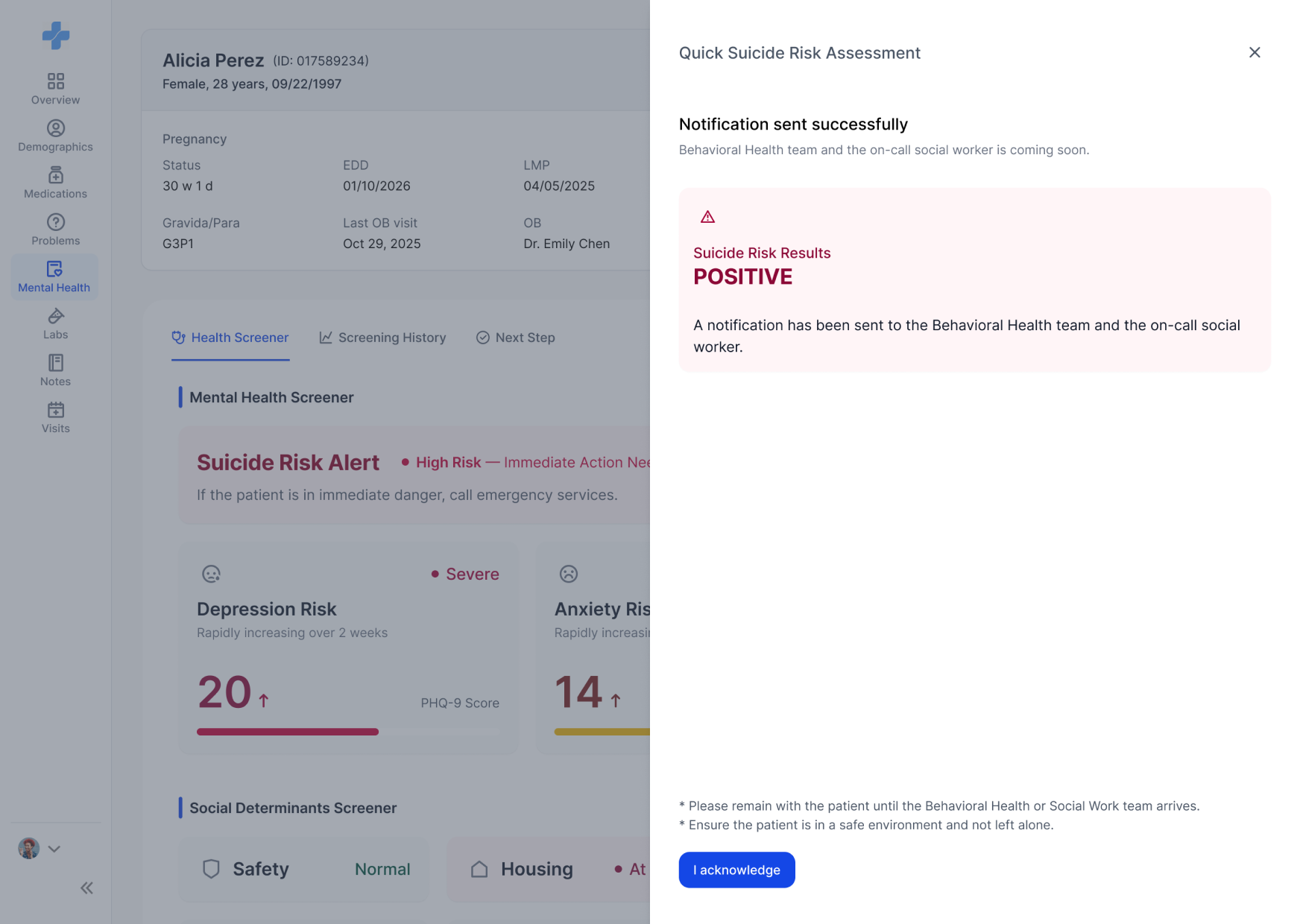
Urgency changes the order of the experience.
The final experience
Screening and intervention now happen in the same flow.
The final MVP brings together what had previously been spread across a PDF, historical records, reference documents, and external resources.
SPOT THE RISK
Spot the risk
Review current screening results and important alerts.
MORE CONTEXT
Get more context when they need it
Check patient information and screening history without cluttering the primary view.
ACT
Act without starting over somewhere else
Move directly into risk assessment, medication review, resources, and follow-up.
Impact
A clinically validated report became a workflow clinicians could actually use.
The MVP reduced the amount of searching, cross-referencing, and external navigation required between screening and intervention, addressing the main usability issues identified with the original PDF.
4 → 1
places to check
PDF, past records, reference tables and external resources now live in one flow.
65%
less time from result to action plan
Based on 30+ usability tests

iF Design Award 2026

Red Dot Design Award 2026

IDEA 2026 Finalist
Digital Interaction
What I took away
Sometimes the information isn’t the problem. The work required to use it is.
We started with content that was already clinically validated. My job wasn’t to simplify the clinical thinking behind it.
It was to figure out
When each piece of information was useful, how much a clinician needed to see, and when the product should stop informing and start helping them act.
That became the thread through the entire project—from the information architecture to the five-step intervention flow.